When I think of football shirts with sashes, my mind immediately points to the Peru national team. But there are so many teams—at club and national level—that have adorned the diagonal stripe we know as a “sash” and I’ve picked 10 of the best.
1. Peru national team
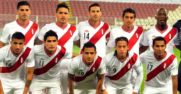
Peru wear red and white, the national colours and first wore their red sash kit in 1936. Many have praised the design over the years and according to historian Jaime Pulgar-Vidal Otálora, the sash design originated from school football matches in which coloured sashes worn over the shoulder would allow two teams wearing white shirts to play against each other.
2. LA Galaxy
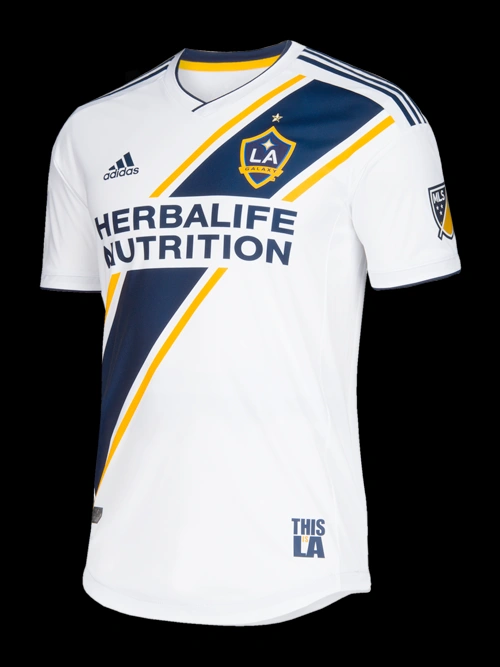
For most people outside of the US, LA Galaxy conjures images of David Beckham and his rollercoaster ride on the West Coast. But the above kit comes from 2018, many years after he left and the sash is a subtle blue sash with yellow trim, covered by the less-than-deal Herbalife Nutrition sponsor. You’ll come to realise that a lot of sash designs are either enhanced or dampened by the sponsor design.
3. Motherwell (2023/24)
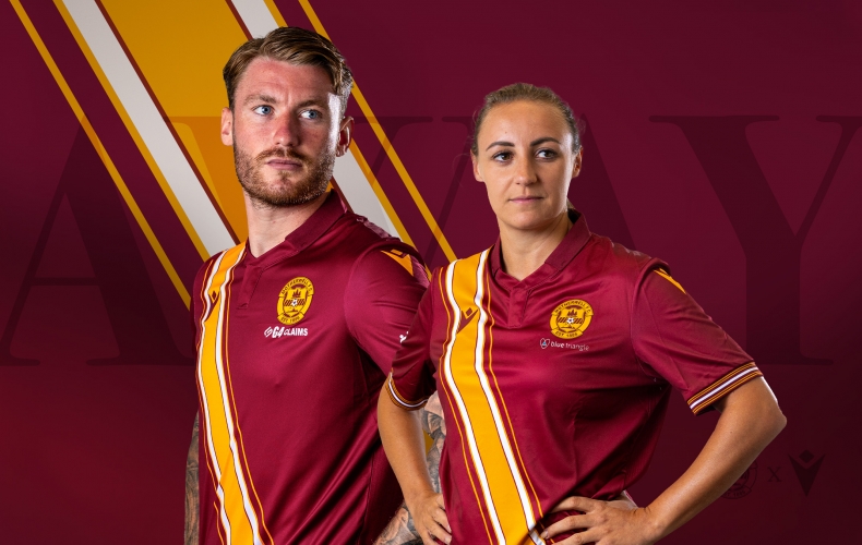
Another sash with a trim, this time from Motherwell. That gorgeous burgundy shirt with the golden sash trimmed out with white and a thin strip of gold. It’s as elaborate as you can get with some diagonal lines but it has character and it’s distinctive. And did I mention the gold?
4. Rapid Wien (2021-22)
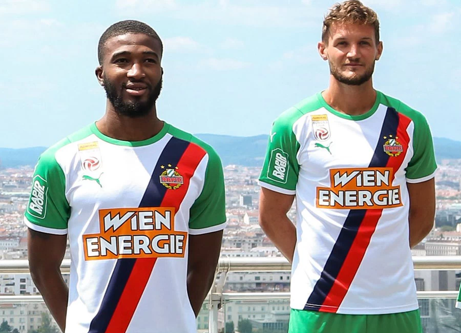
I’m a sucker for block colours and Rapid Wien’s home kit from 2021-22 is perfect with the green sleeves, white torso, and a navy and red right-to-left sash. I don’t even mind the Wien Energie sponsor logo over the top as it keeps with the blocking style. It might not be to everyone’s taste but block colours win out for me.
5. USA (1950)
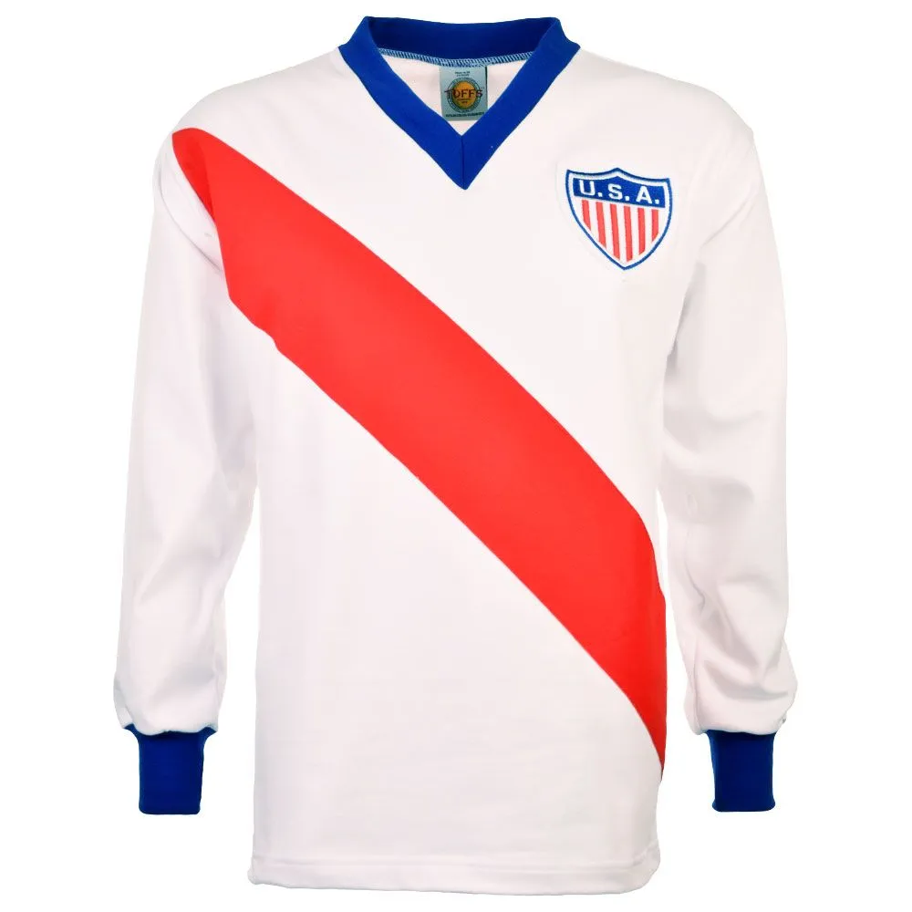
It’s the World Cup that England tries to forget and the US loves to remember. This home shirt is from the 1950 World Cup where the USA beat England 1-0 in the group stages, adding salt into the wounds of their tournament exit. And they did it with a red sash on their white shirt with navy trims on the collar and cuffs. It’s minimal and it works—Peru weren’t at the 1950 World Cup so they were the only sashed team out there.
6. Crystal Palace
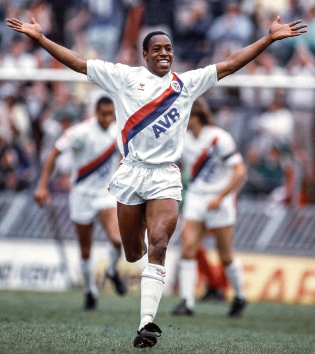
Besides Peru, Crystal Palace is famous for its sashed away kits and if I had to pick one, this would be my favourite. It’s minimal and there are those block colours again. And the Helvetica font on the AVR sponsor logo. Chef’s kiss! And who better to model this than the legend Ian Wright.
7. Plymouth Argyle (1995/96)
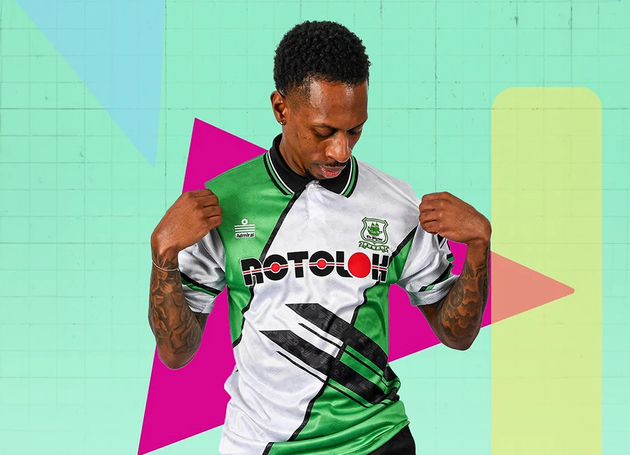
Plymouth said “what if we had a sash but made it wider, then added some ostentatious designs over the top because it’s the 90s?” and they somehow pulled it off. Here, we get a green shirt dwarfed by a thick white sash, trimmed in black. But we also get some intersecting dashs around the abdomen and a bold ROTOLOK sponsor across the middle. It shouldn’t work and it’s arguably an assault on the eyes but it’s so 90s that I love it. And ROTOLOK still uses that logo, which I respect.
8. Altrincham (2023/2024)
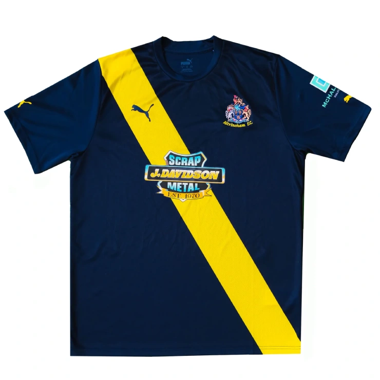
Keep it simple is the motto with this away shirt. We have a deep navy blue shirt, a left-to-right lemon sash, and a gorgeous 70s style sponsor logo from J. Davidson Scrap Metal. It looks like a retro shirt but it’s their current away kit. Sweden would be proud and anyone who owns this shirt should be too. Excellent execution.
9. Vasco da Gama (2024)
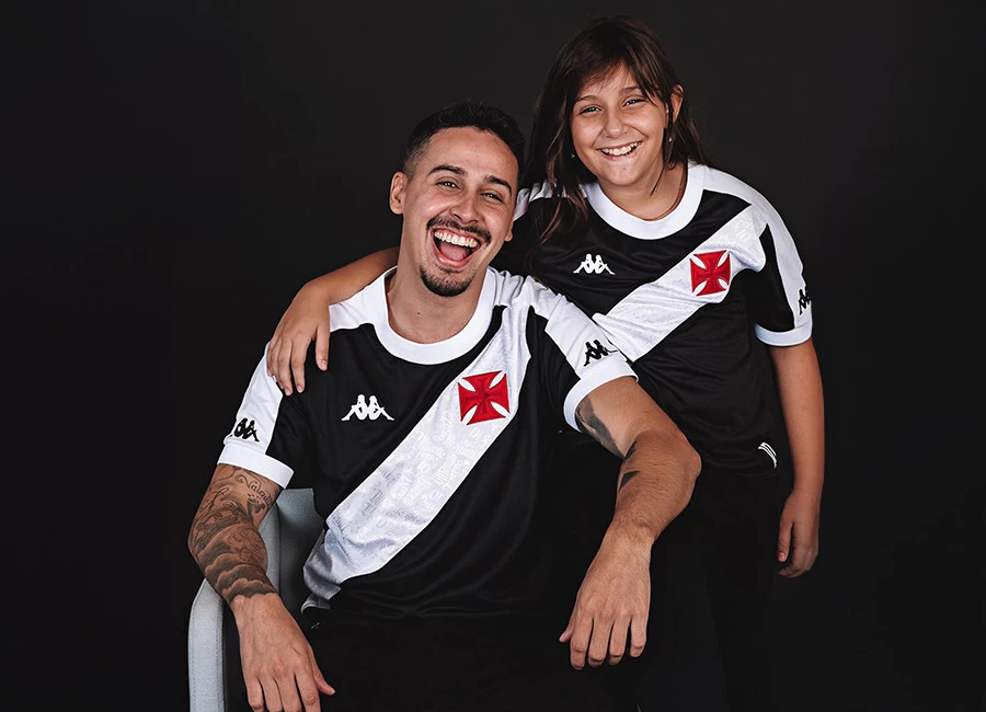
We have a black shirt with white sash, white shoulder and arm trims, and white cuffs, the famous red Maltese cross crest, Kappa as the kit manufacturers and, if you look closely, references to the late Vasco legend Roberto Dinamite printed on the sash. It’s so Brazilian and I love it.
10. River Plate (1992–1994)
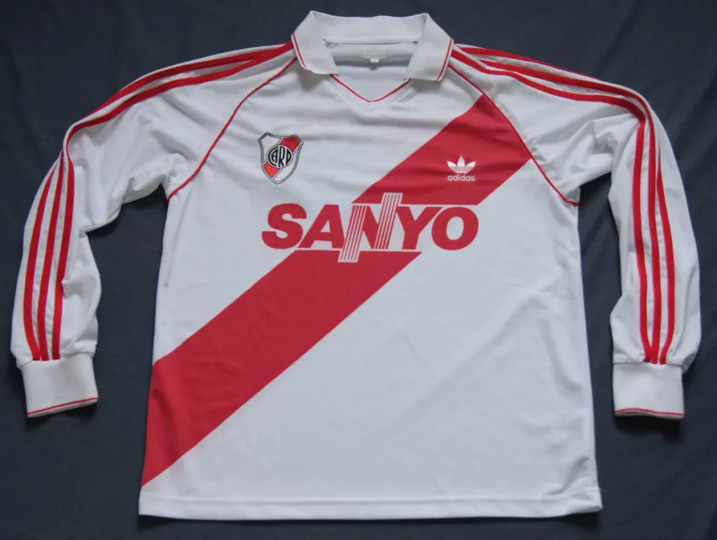
Saving the best til last, we have River Plate’s home shirt from 1992–1994. It’s a masterpiece: Adidas as the kit manufacturer so already onto a winner, a right-to-left red sash on a white shirt, the red triple strip arm trim and Sanyo as the sponsor. It’s the perfect choice. My favourite sash design, hands down.